
This site is best viewed in portrait mode.
Please rotate your device.
This site is best viewed in portrait mode.
Please rotate your device.
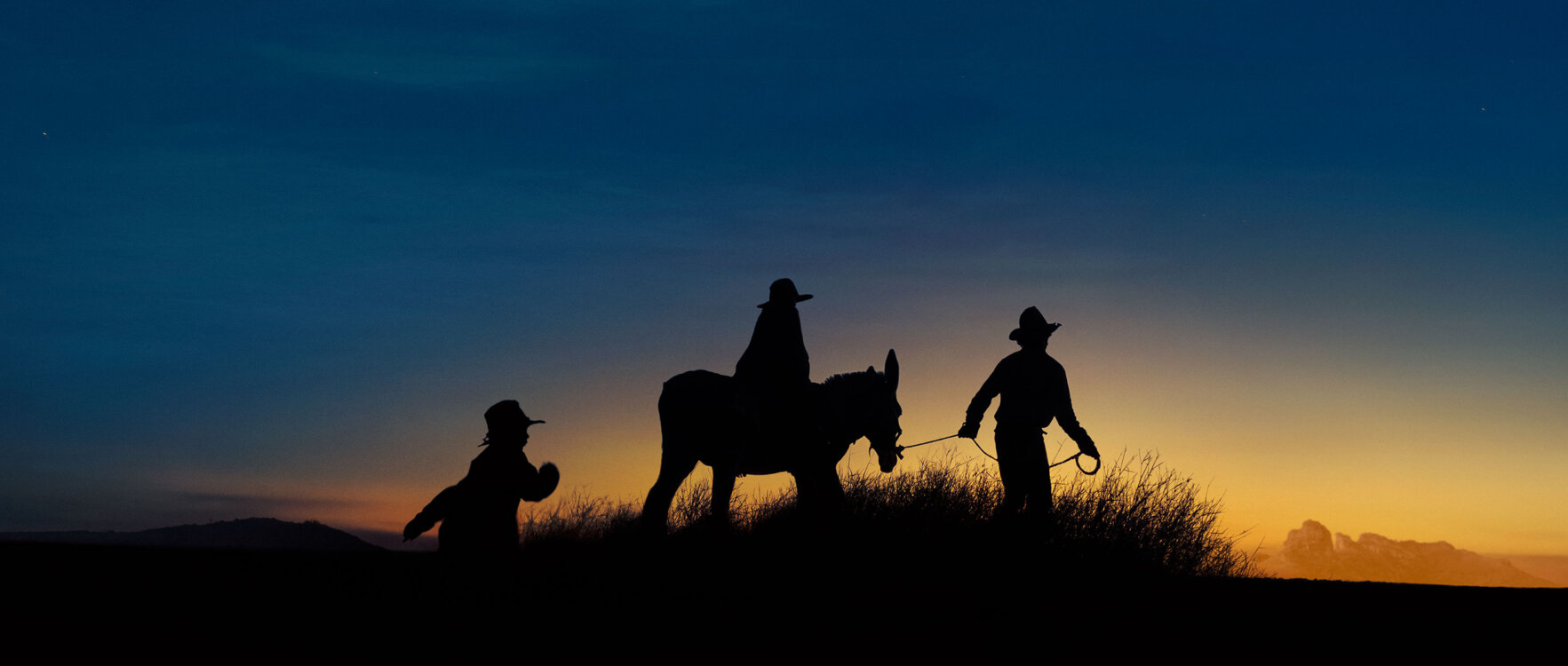
Set a few years after Sweet Country, Wolfram follows Indigenous mother Pansy (Deborah Mailman) searching for her stolen children, Max and Kid, who are forced into child labour in 1930s tungsten mines. The film, set during the Stolen Generations era, focuses on resilience, survival, and colonial exploitation. Carnival were engaged during production to develop a full creative marketing campaign, from festival key art and character posters, a full theatrical trailer, social + TVC cutdowns and a full social suite. Honouring the importance of the stories, we developed a campaign that balances the rugged beauty of the country with the coarseness of colonial Australia.
Projects with full freedom and trust are rare and valuable, and we express our admiration and thanks to the wonderful folk at Bunya, as well as Warwick, for a rewarding creative collaboration that is honest, gritty, and captures the world of 1930’s Australia.

The unique challenge of creating the theatrical trailer for Wolfram lay in the delicate balance of two distinct aspects of the film – a familial love story juxtaposed with an Australian-style Western/chase genre. Whilst the film is incredibly beautiful in its pacing and cinematography, it is also often brutal in its depiction of the dangers the two children face. This presents a fine line for the trailer to strike the right tone – showing enough optimism and warmth to feel inviting to audiences without hiding the sense of danger and menace that runs through the film.
Our process of achieving this involved a thorough breakdown of every element of the film, separating out every piece of dialogue, scenic scope shot, character visual, action sequence and stylistic accent. These pieces became like building blocks to re-create a tiny version of the film – working within the specific visual conventions of film trailers, which are an art in themselves. Over a few iterations of developing the edit, creating and finessing the sound design, and collaborating with the film’s producers, a cut was created that told enough of the story to be informative and enticing, playing on our emotions and empathy without giving away any spoilers.
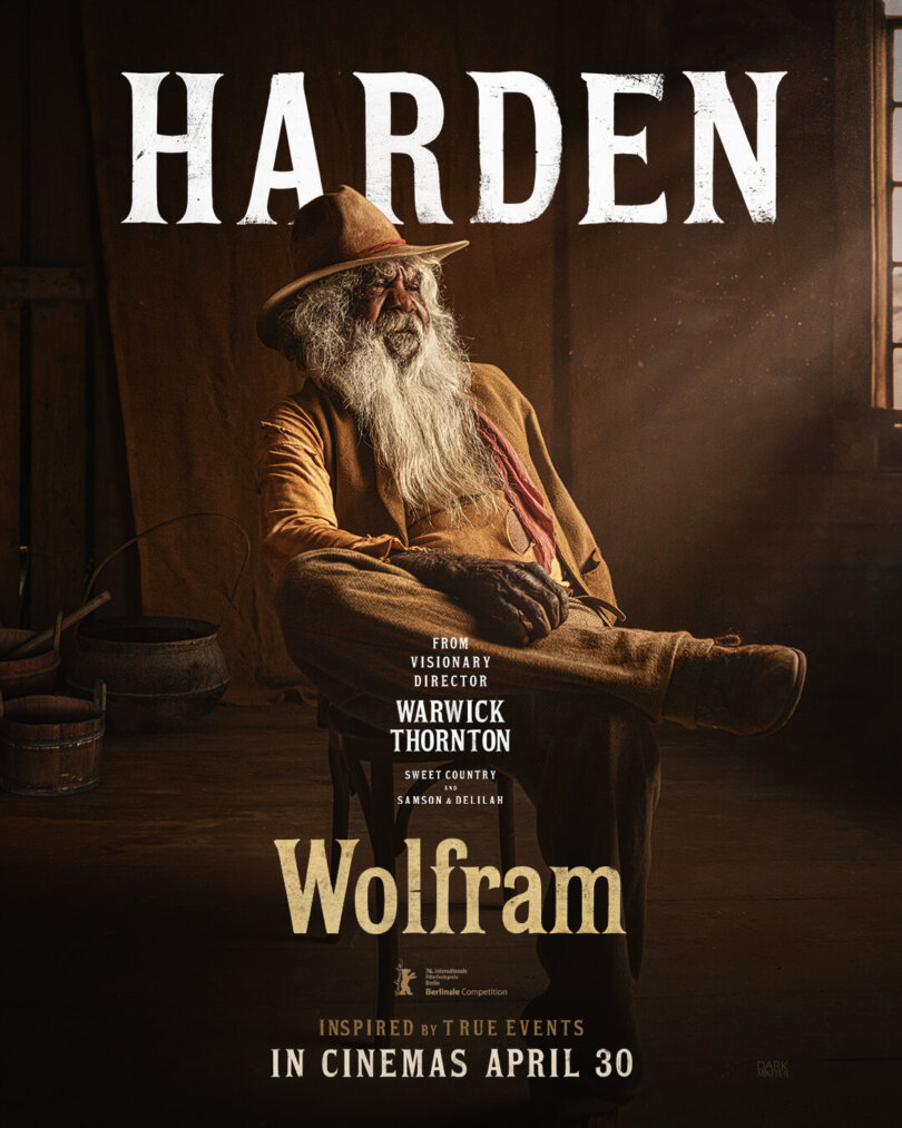
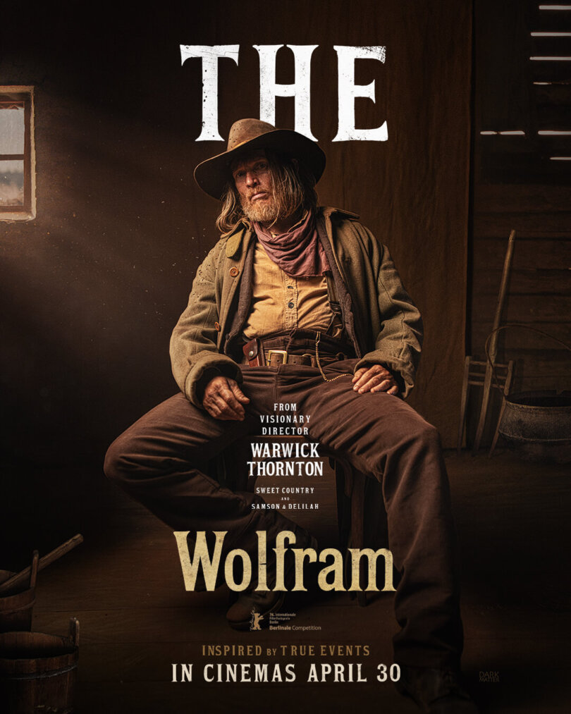
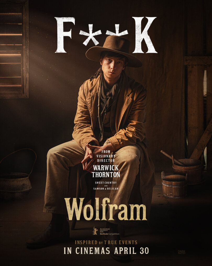
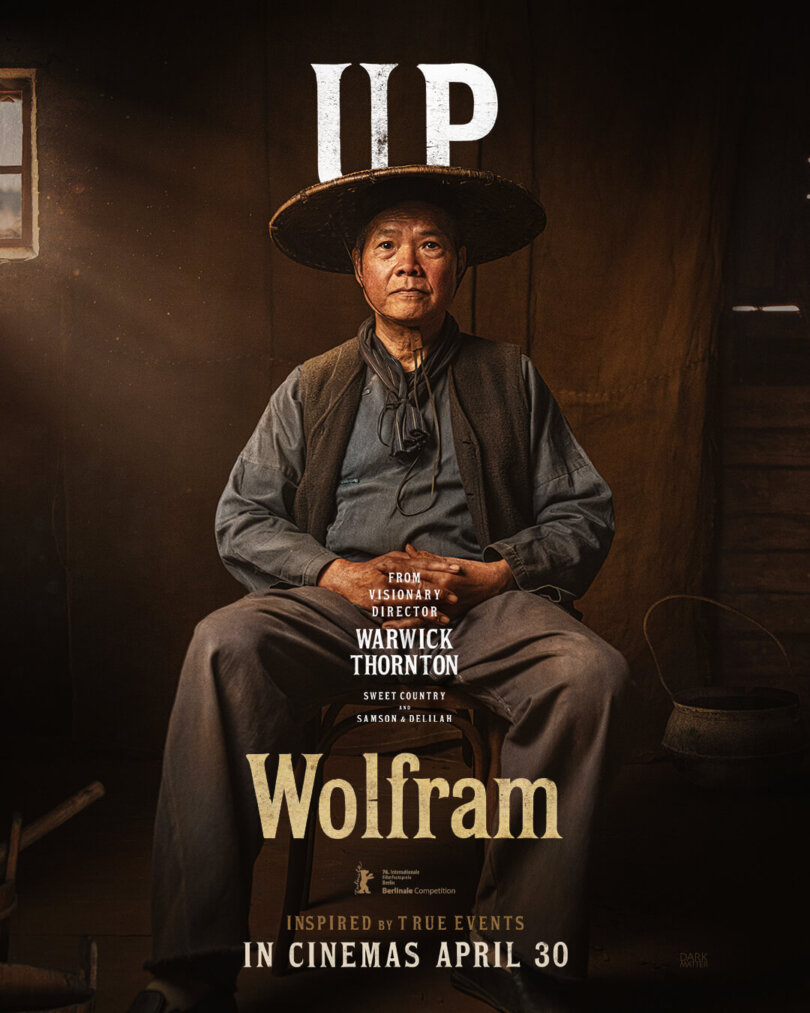
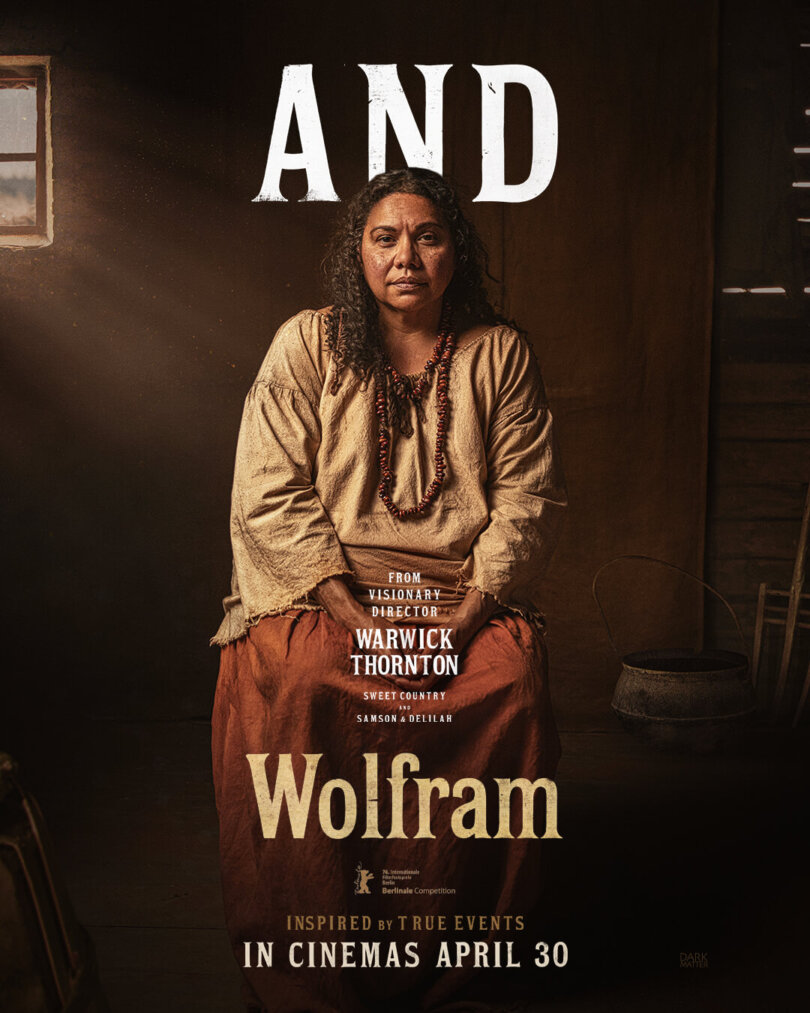
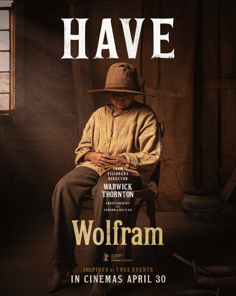
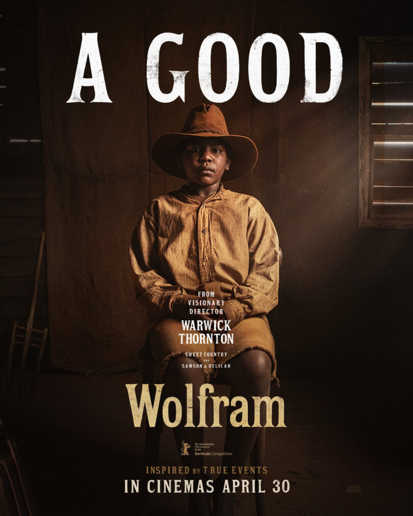
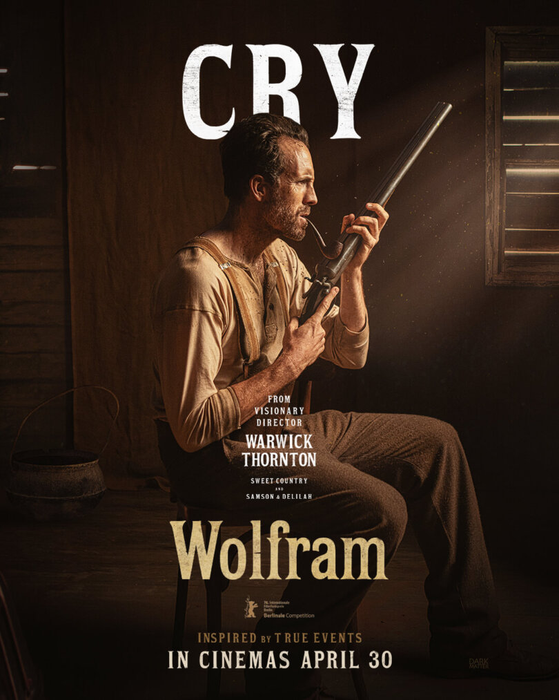
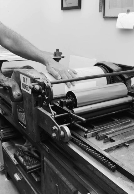
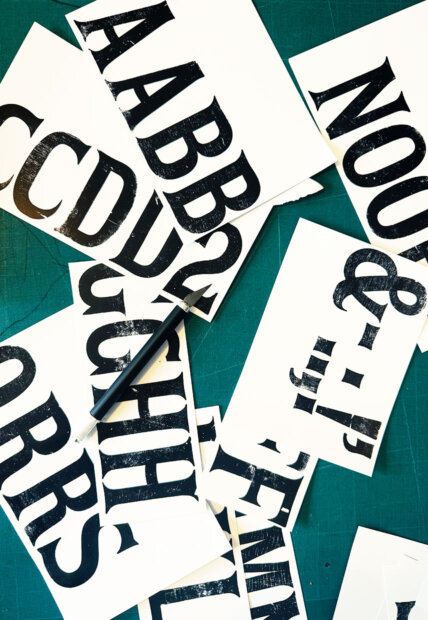
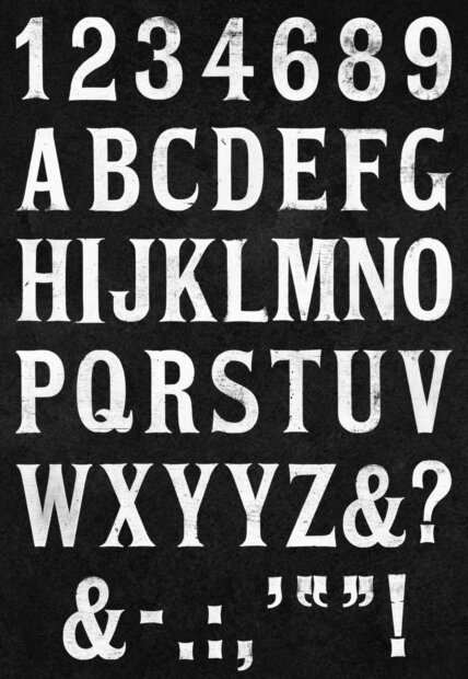
For WOLFRAM, typography became an extension of the film’s world. Set in the 1930s, the approach went beyond visual reference. In a time shaped by fast, synthetic outputs, we returned to the era’s physical processes. Instead of choosing a typeface and adding texture, we rebuilt the method itself.
Working with letterpress printer Matt Tilbury of The Tilbury Press, we used traditional wood and metal type, composed by hand, inked, and printed on analogue presses. Each print carries subtle variations in pressure and ink that are difficult to replicate digitally. The process was slow and deliberate, focused on nuance rather than efficiency. Every piece was then scanned, preserving the original prints’ physical details.
The result is typography that does not just reference the period, but feels part of it.
t +61 2 9431 3200
e hello@carnivalstudio.com.au
Suite 5, 22 Fred St
LILYFIELD NSW 2040
Sydney Australia


