
This site is best viewed in portrait mode.
Please rotate your device.
This site is best viewed in portrait mode.
Please rotate your device.
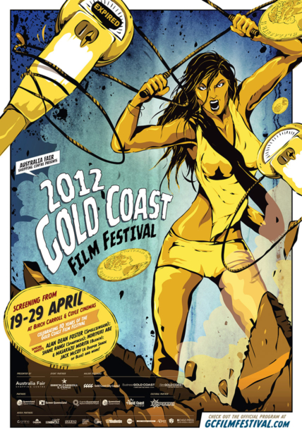
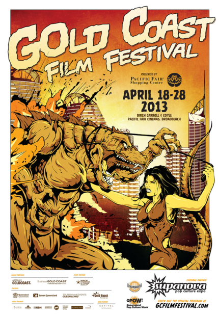
The initial brief from festival organisers in 2012 was to create a fun, accessible identity for the festival which had previously lacked a defined identity. The festival was closely aligned with the Supanova Pop Culture Expo and this association was sought to be leveraged. We began idea development and arrived at the idea of creating a hometown superheroine in the form of a kick-ass meter maid, designed to flip their image from being objectified to empowered. Working with Aisle6 and street artist Cam Scales, our meter maid heroine was brought to life for the 2012 poster. The 2013 poster was an extension of the fantasy themes with our meter maid fighting off a Godzilla-like monster.
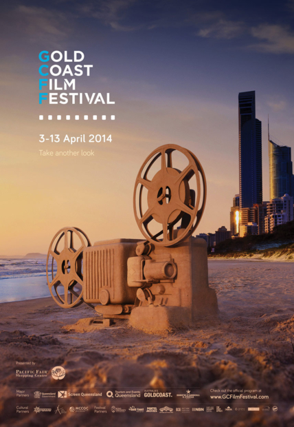
In 2014 the festival parted ways with Supanova to stand alone. A new logo was commissioned to represent the festival, which remains in use today.
The key art brief was for the festival to be projected as a more refined affair, so we developed a creative direction that plays upon the renowned sandcastle festival held on the Gold Coast every year. Using 3D modelling, texturing and rendering – Carnival built a giant film projector from sand which captures the beautiful location and combines two key aspects – location + film.
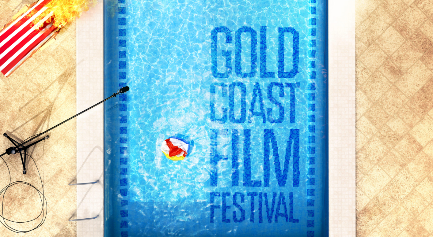
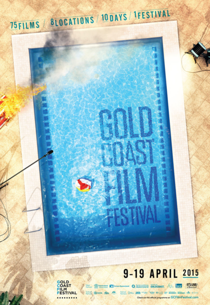
2015 saw a return to developing a visual idea in 3D. We had floated the idea of a top-down view, looking at the Gold Coast city CBD in which buildings would be crafted from stacks of old-style film tins but this evolved to using a common hotel-style pool in a visual metaphor for film with the spool-holes as mosaic tiles painstakenly recoloured digitally.
The Gold Coast Film Festival were a dream client for their willingness to explore bold and creative directions.

t +61 2 9431 3200
e hello@carnivalstudio.com.au
Suite 5, 22 Fred St
LILYFIELD NSW 2040
Sydney Australia


